
The Psychology of Color: How Design Shapes the Way We Feel
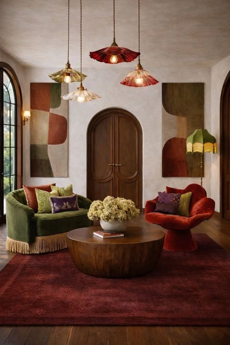
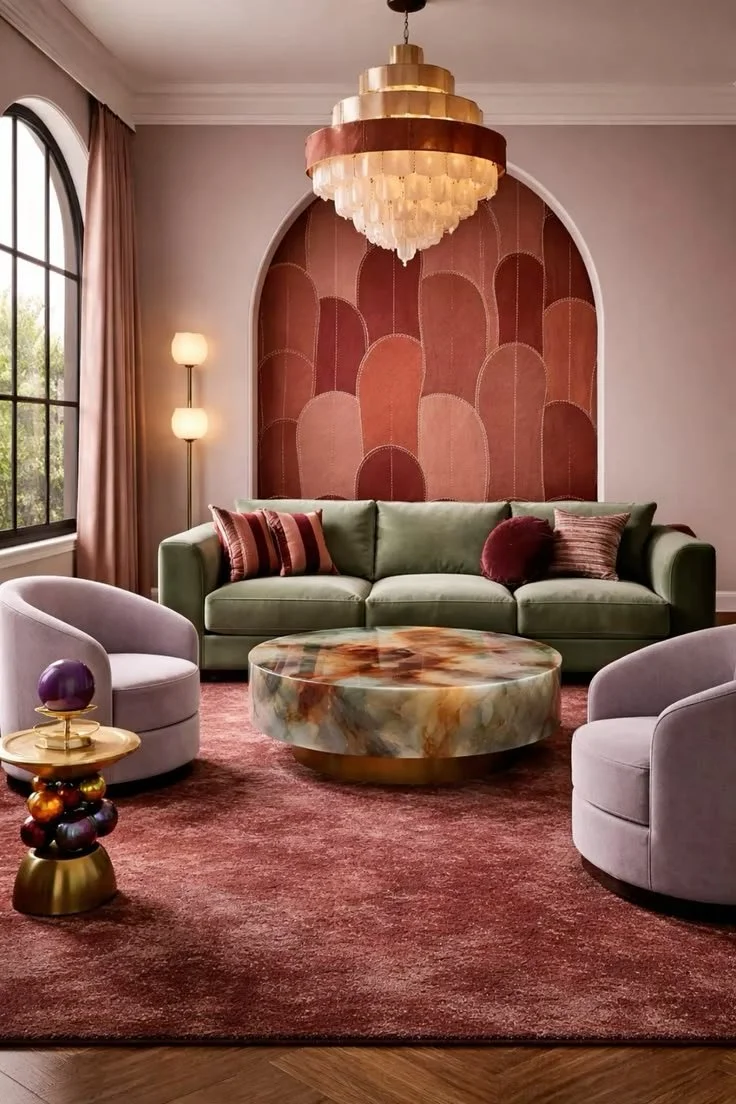
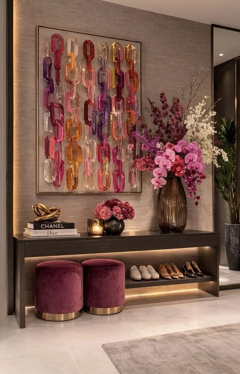
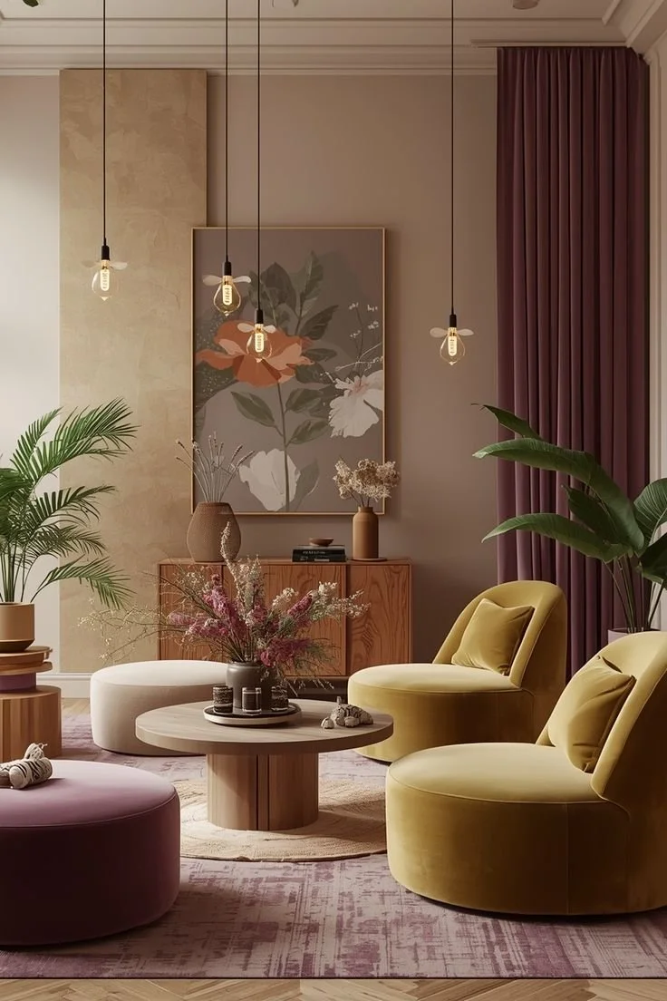
Every room tells a story, and color is often the first chapter.
Long before we notice the furniture, artwork, or architectural details, our brains begin responding to color. Whether we're aware of it or not, color influences our emotions, our energy levels, and even the way we experience a space. It's one of the most powerful tools in interior design because it speaks directly to how we feel.
At Bita Interior Design, we believe that selecting a color palette is about much more than choosing beautiful paint. It's about creating an atmosphere that supports the way you want to live every day.
Why Color Affects Our Emotions
The connection between color and emotion is rooted in both psychology and biology. Our brains naturally associate colors with experiences we've encountered throughout our lives.
The warm glow of a sunset evokes comfort. The greens of nature signal growth and tranquility. Blue skies and calm water create feelings of peace and openness. These associations, combined with cultural influences and personal memories, shape how we respond to color.
While everyone's experiences are unique, researchers have consistently found that certain colors tend to evoke similar emotional responses across many people.
Warm Colors: Energy, Connection, and Comfort
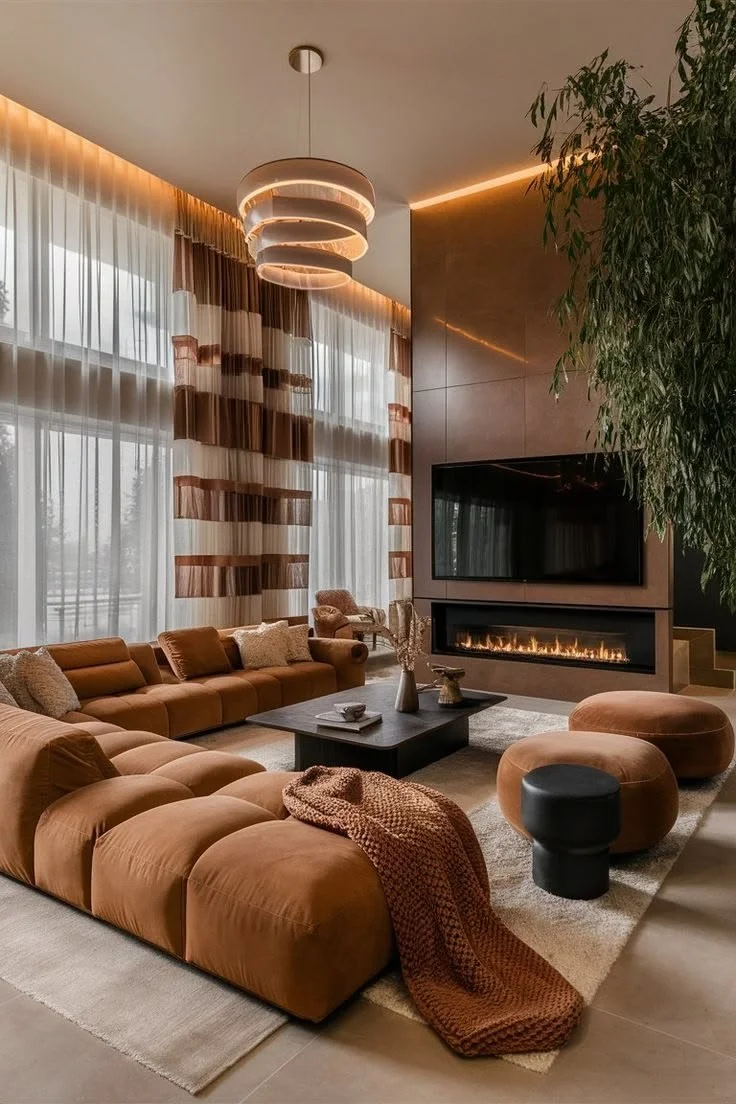
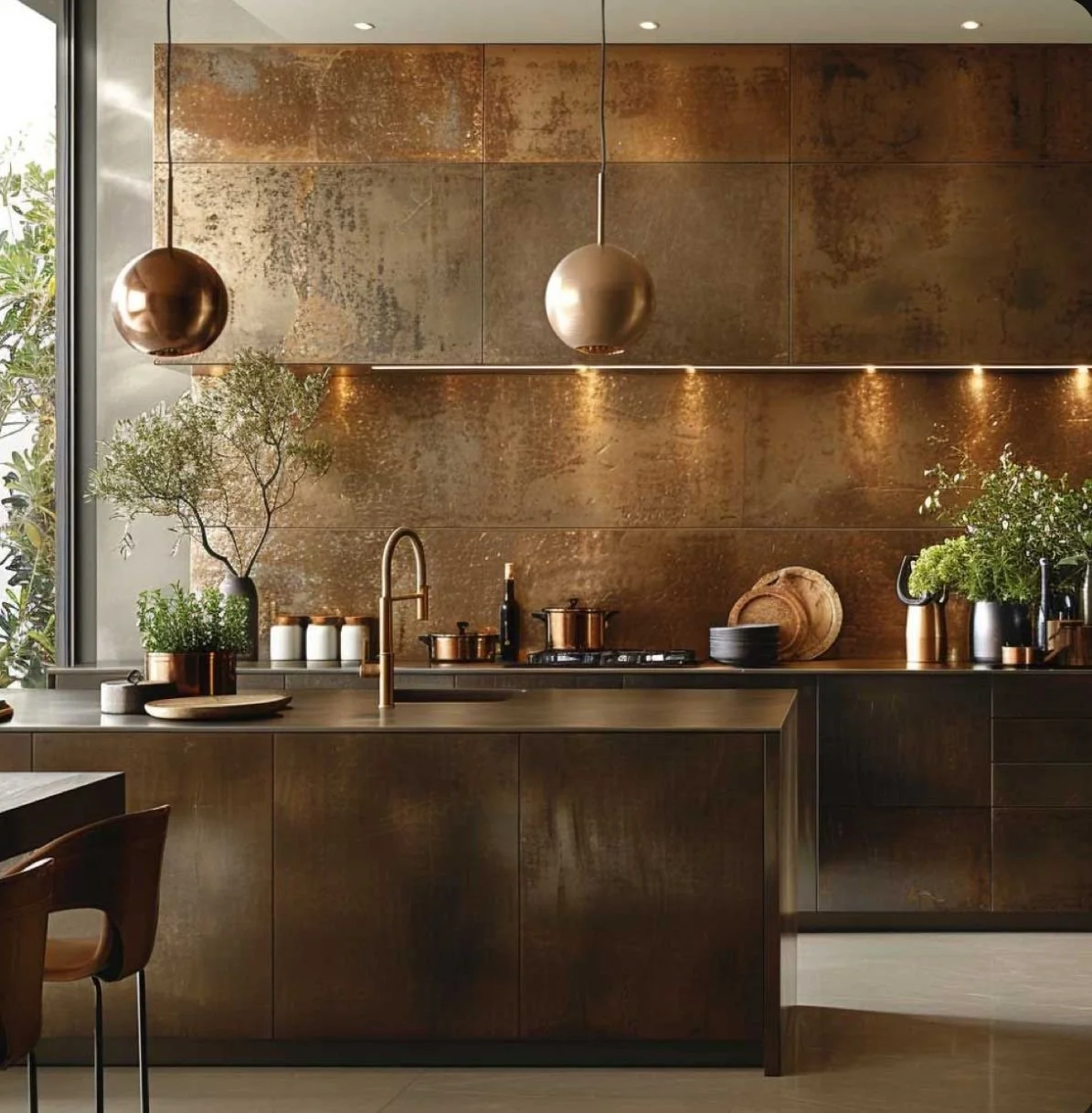
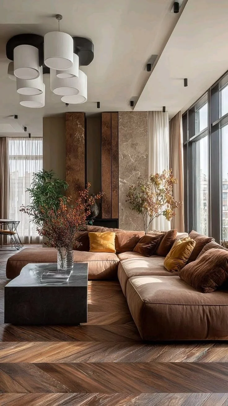
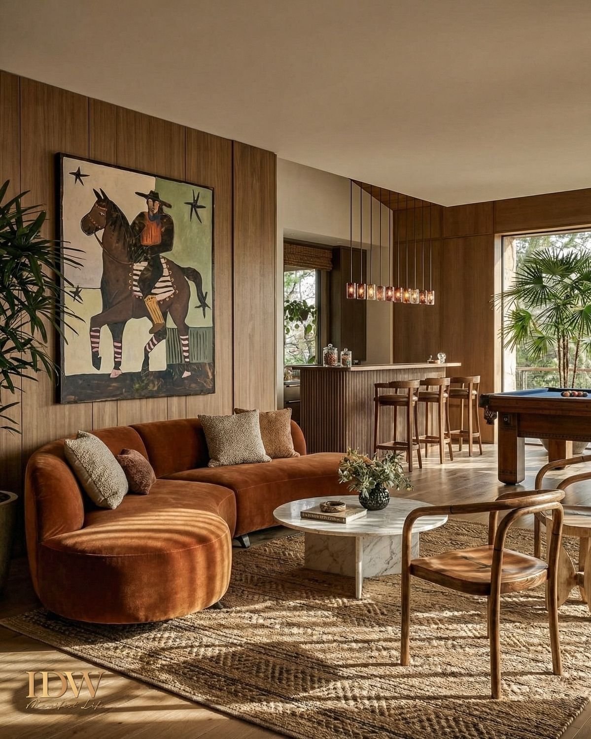
Warm colors, including reds, ranges, and yellows, bring energy and warmth into a space.
Rich terracotta, warm caramel, and muted clay tones create inviting environments where people naturally gather and connect. These colors can make large spaces feel more intimate and welcoming, making them excellent choices for dining rooms, kitchens, and entertaining areas.
When used thoughtfully, warm tones encourage conversation, creativity, and a sense of hospitality.
Cool Colors: Calm, Balance, and Relaxation
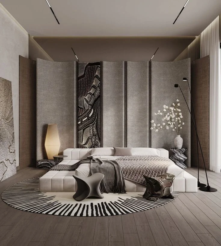
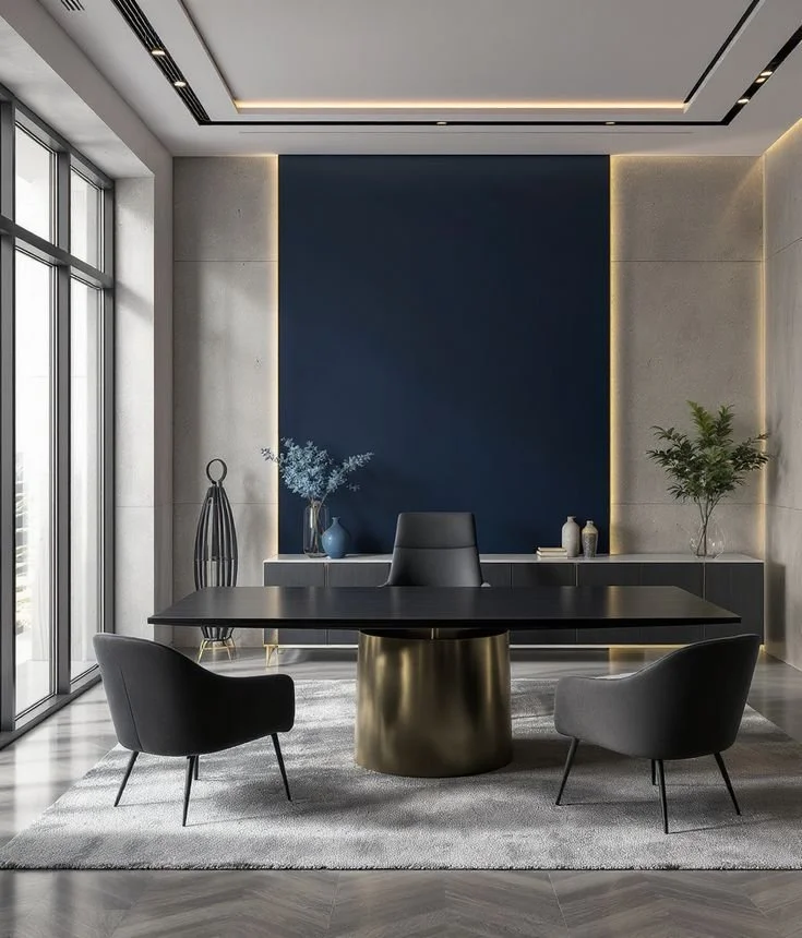
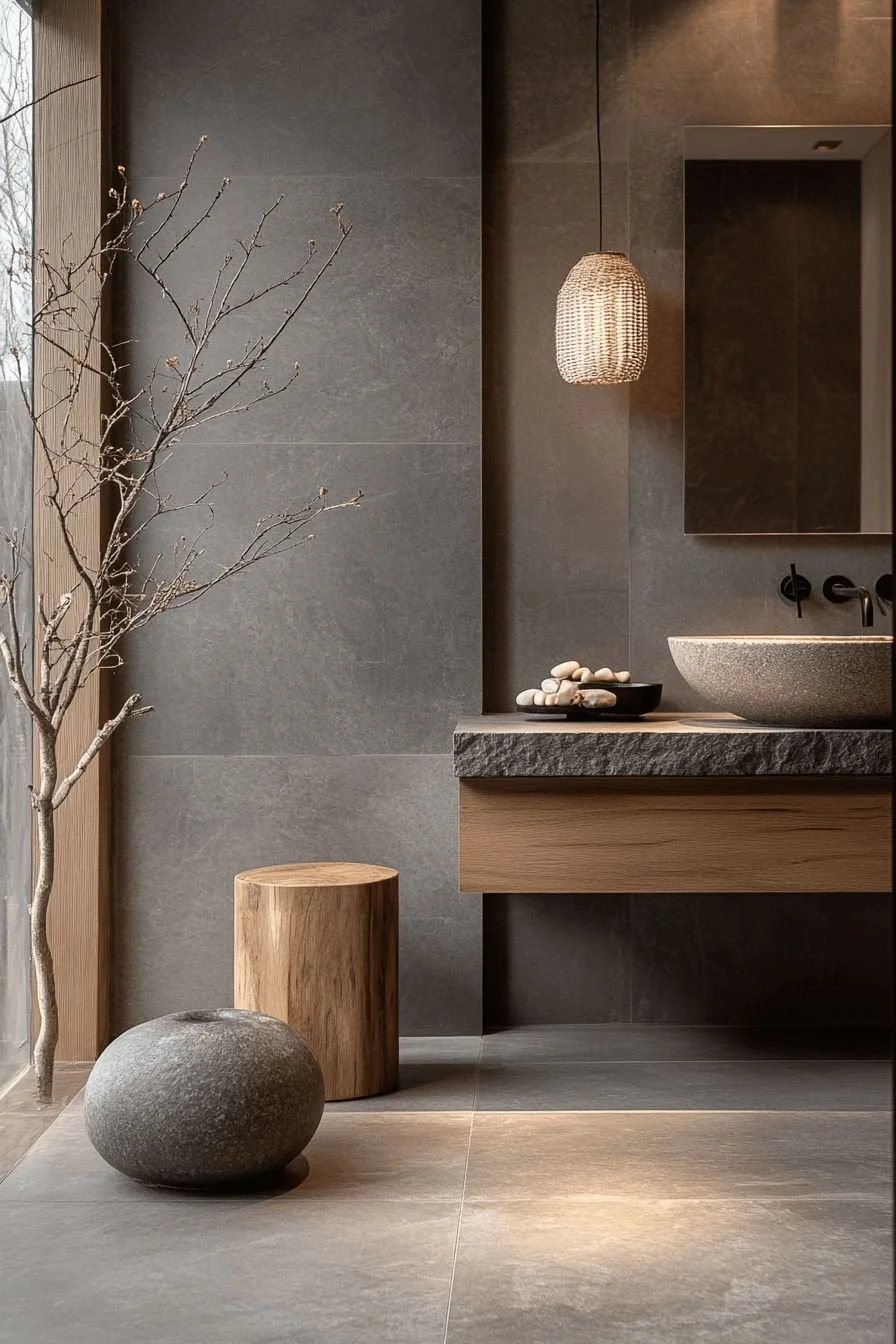
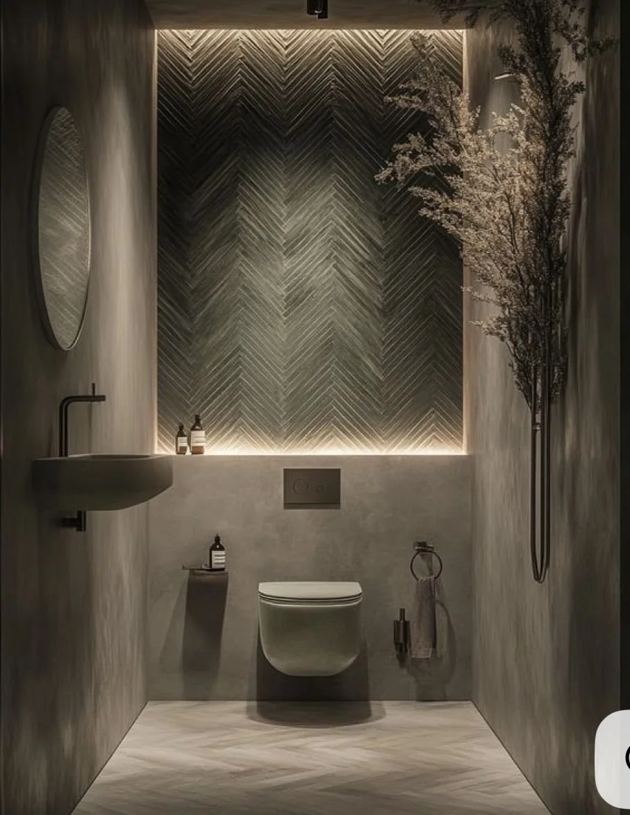
Blues, greens, and soft grays are often associated with tranquility and restoration.
Blue can slow the visual pace of a room, making it feel peaceful and expansive. Green reminds us of nature and promotes balance and renewal. Soft gray provides a calming backdrop that allows textures and natural materials to shine.
These colors work beautifully in bedrooms, bathrooms, home offices, and wellness spaces where relaxation and focus are priorities.
Neutrals: The Foundation of Timeless Design
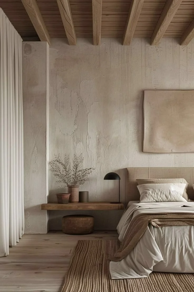
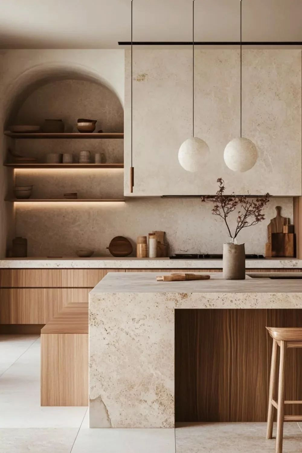
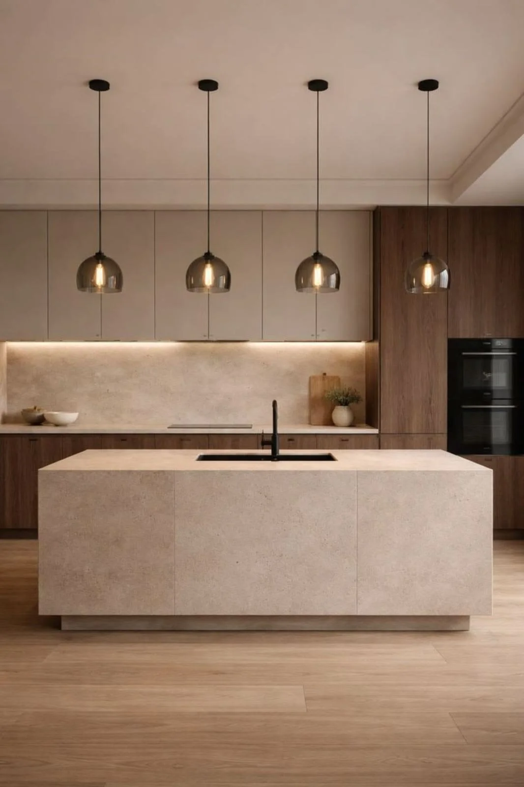
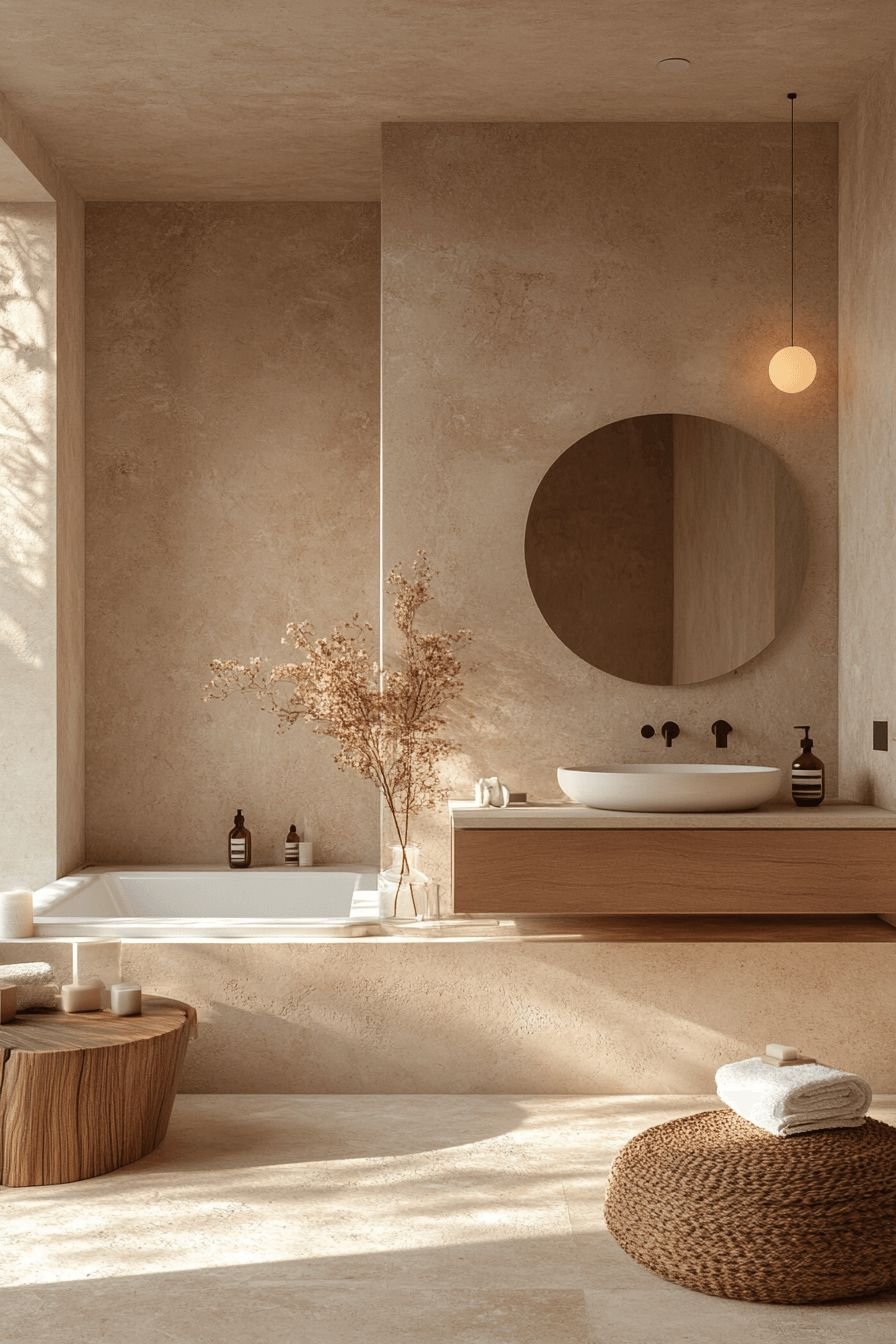
Neutral doesn't mean boring.
Soft whites, warm ivories, natural linens, taupes, and earthy beiges create spaces that feel effortless and timeless. Rather than competing for attention, they allow architecture, craftsmanship, artwork, and furnishings to become the focal point.
Layering different neutral tones with natural materials like wood, stone, linen, and wool creates depth, warmth, and sophistication without overwhelming the senses.
This is why many luxury interiors rely on carefully curated neutrals. They create a sense of quiet elegance that never feels dated.
The Power of Natural Light
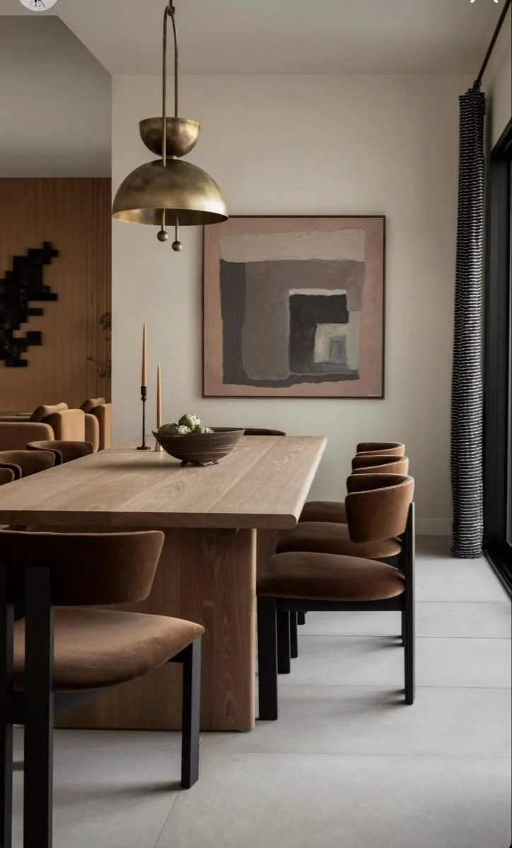
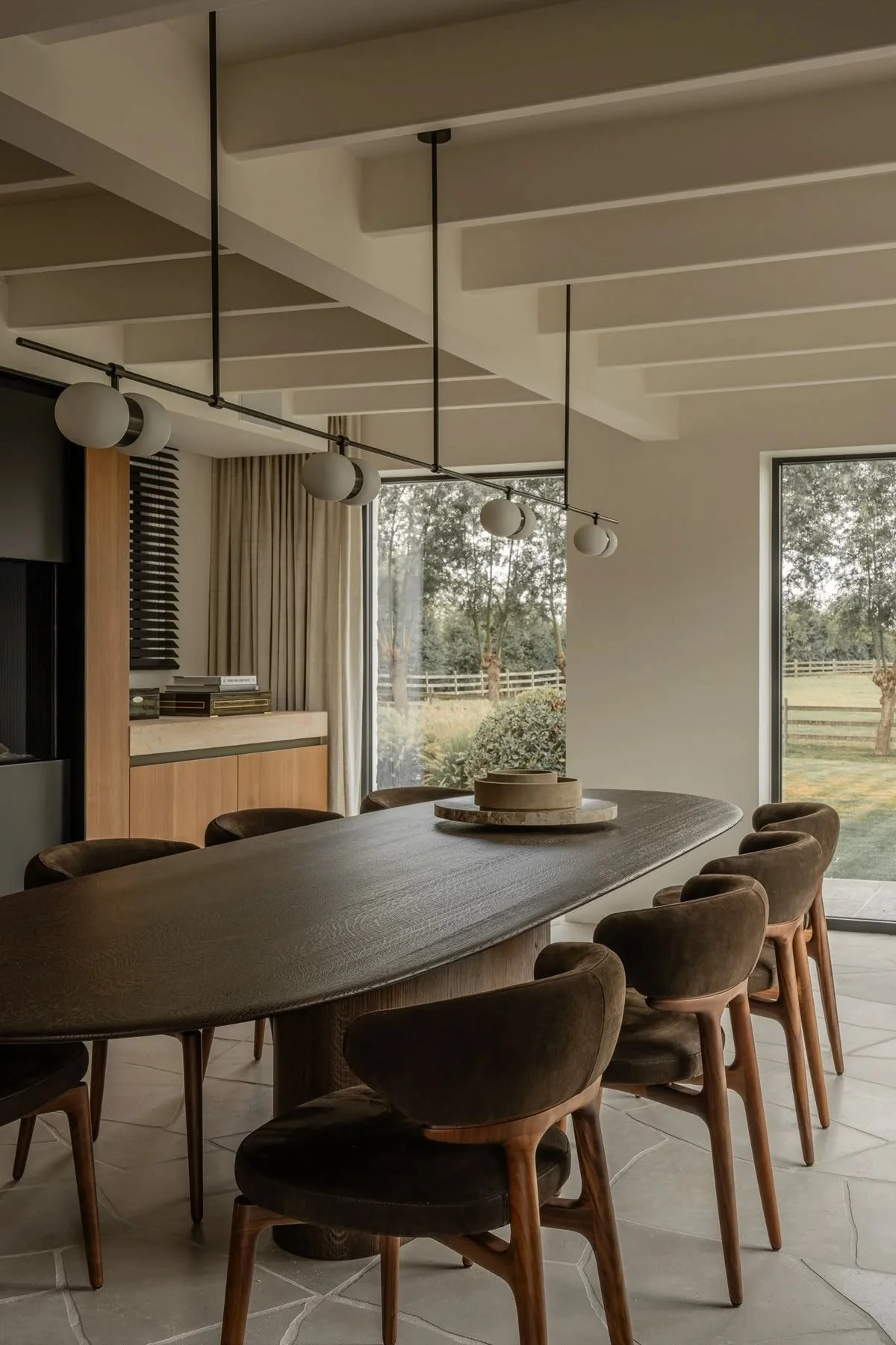
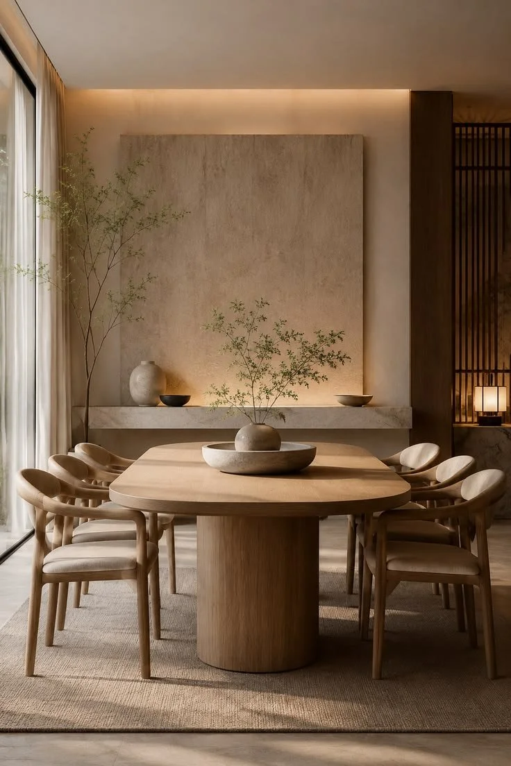
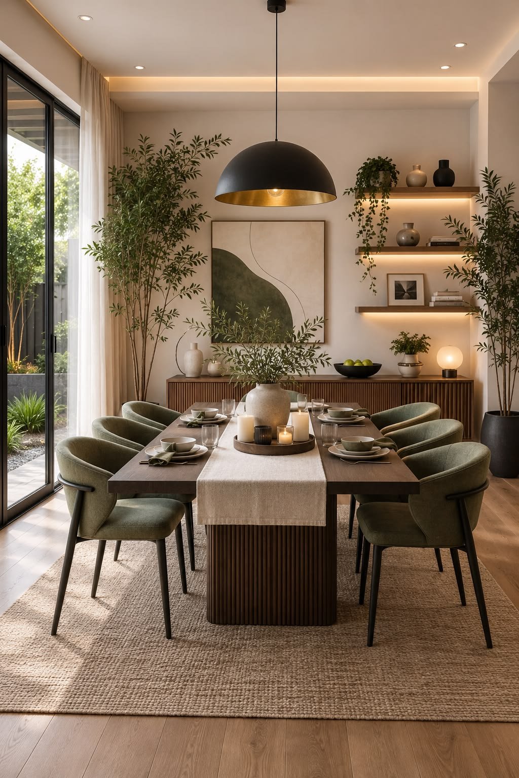
Color is never static.
The same paint color can appear completely different depending on the time of day, the direction a room faces, and the type of lighting used.
Morning light often enhances cooler tones, while afternoon sunlight brings warmth to a space. Artificial lighting can dramatically change how a color is perceived, making sample testing an essential part of the design process.
Understanding how light interacts with color allows us to create interiors that remain beautiful throughout the day.
Texture Changes Color
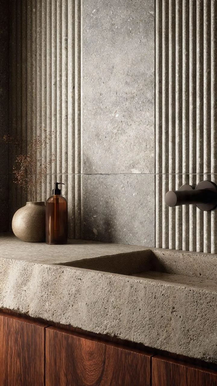
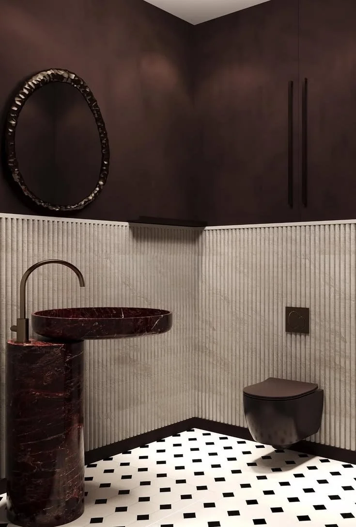
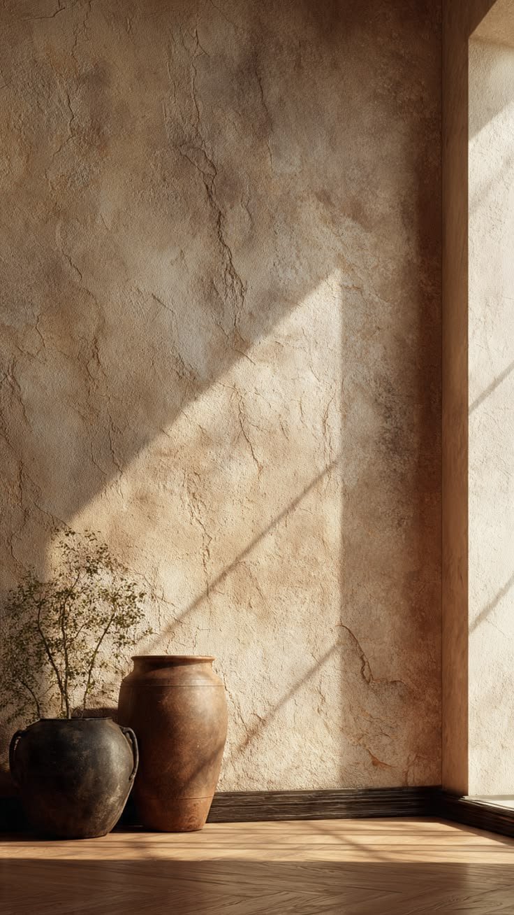
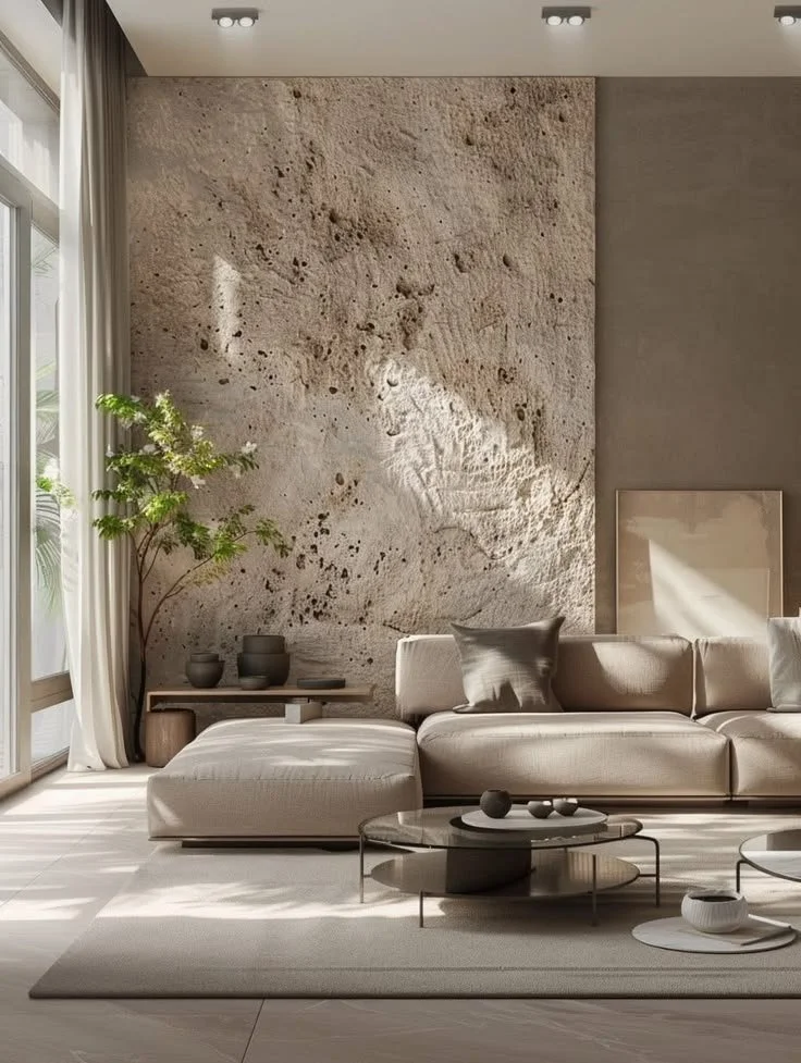
Color is only part of the equation.
The finish and texture of a material can dramatically alter how a color feels.
A matte wall painted in deep green feels soft and sophisticated, while the same color in polished stone becomes luxurious and dramatic. Velvet absorbs light differently than linen. Brushed oak feels warmer than glossy lacquer. Natural plaster reflects light differently than painted drywall.
Great interior design considers not only the color itself but also how materials interact with light to create depth and dimension.
Designing for Emotion
The best interiors aren't built around trends—they're built around people.
Every client has a different lifestyle, personality, and vision for their home. Some want a peaceful retreat after busy workdays. Others want vibrant spaces designed for entertaining family and friends. Some seek warmth and comfort, while others prefer clean, minimal environments that promote focus.
Color helps bring those feelings to life.
A thoughtfully designed home should support the emotions you want to experience every day, whether that's calm, joy, creativity, confidence, or connection.
More Than Beautiful Spaces
At its best, interior design goes beyond aesthetics.
It shapes how we begin our mornings, how we gather with loved ones, how we unwind after long days, and how we experience the moments that matter most.
Color is one of the most powerful ways to influence those experiences. When chosen with intention, it transforms a house into a home that doesn't simply look beautiful; it feels beautiful.
Because exceptional design isn't just about what you see. It's about how a space makes you feel the moment you walk through the door.